The Command Pattern:
Unlocking Flexibility and Control in Software Design
n today’s fast-paced world of software development, creating systems that are modular, flexible, and easy to maintain is essential. Design patterns play a critical role in achieving these goals by providing reusable solutions to common problems. Among these, the Command Pattern stands out as a behavioral design pattern that encapsulates requests as objects, allowing you to parameterize and decouple clients from the objects that execute specific operations.
The Command Pattern is instrumental in scenarios where actions need to be queued, executed, or even reversed. It provides a way to build robust systems that can handle a variety of tasks—from implementing undo/redo functionality in user interfaces to managing complex transactional processes. Curate Partners understands the importance of such design patterns and offers consulting services to help businesses find specialized talent skilled in implementing the Command Pattern. This article explores the key components, benefits, and common use cases of the Command Pattern, and how Curate Consulting Services can help organizations leverage this approach.
What is the Command Pattern?
The Command Pattern is a behavioral design pattern that turns a request into a standalone object, which can be stored, passed around, and executed later. By encapsulating a request as an object, the pattern allows developers to parameterize clients with queues, requests, and operations. It also promotes loose coupling between the sender (the client that initiates a request) and the receiver (the object that performs the action).
In simpler terms, the Command Pattern helps separate the act of making a request from the process of fulfilling it, providing a structure that enhances flexibility and scalability. This separation not only simplifies the code but also opens up possibilities for additional features, such as undo/redo operations, logging, and batch processing.
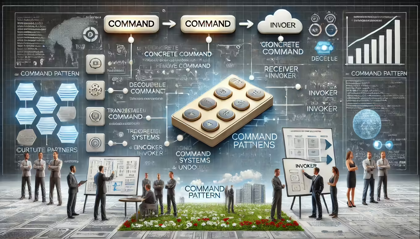
Key Components and Concepts of the Command Pattern
To understand how the Command Pattern works, it’s important to look at its main components:
Command:
- The Command is an abstract interface or base class that defines the methods for executing a command, typically including an
executemethod. Some implementations may also include anundomethod to reverse the action. Concrete command classes implement this interface and encapsulate the logic needed to perform specific actions. - This structure allows clients to work with commands in a uniform way, without needing to know the specifics of the action.
- The Command is an abstract interface or base class that defines the methods for executing a command, typically including an
Concrete Command:
- Concrete commands are specific implementations of the Command interface. Each concrete command represents a particular action, holding all the information necessary to carry out that action. Concrete commands often have references to receivers, which are responsible for executing the actual operation.
- For instance, a concrete command might represent an action such as “save file” or “move object,” with each command encapsulating the logic and parameters needed to perform that action.
Receiver:
- The Receiver is the object that performs the actual work associated with a command. It knows how to execute the action and carries out the requested operation. The command delegates the call to the receiver, ensuring that the sender remains decoupled from the action’s implementation.
- For example, in a word processor application, the receiver could be the document that executes commands like “cut,” “copy,” and “paste.”
Invoker:
- The Invoker is responsible for initiating the execution of the command. It holds a reference to the command and triggers its execution when needed. In some cases, the invoker may also maintain a history of commands, enabling undo/redo functionality.
- This component simplifies client code, as the client only needs to interact with the invoker without worrying about the details of how commands are executed.
Benefits of the Command Pattern
The Command Pattern offers a range of benefits that make it an essential tool for software developers:
Decoupling:
- One of the primary advantages of the Command Pattern is that it decouples the sender of a request from the object that performs the actual operation. This separation promotes loose coupling and flexibility, allowing for easier maintenance and modification of the code.
Undo/Redo Support:
- By encapsulating commands, the pattern makes it possible to implement undo and redo functionality, which is particularly valuable for applications with complex user interactions. Each command can store the information needed to reverse its action, enabling users to backtrack or repeat actions effortlessly.
Command Queues:
- Commands can be queued and executed in sequence, allowing developers to build complex command structures, batch processing, or transactional systems. This makes it easier to manage multiple operations that need to be performed together.
Logging and Monitoring:
- Developers can add logging, error handling, and monitoring capabilities to commands without affecting the client code. This means that every time a command is executed, it can be logged or monitored, providing better insights into system operations and improving error tracking.
Testing:
- Commands are easily testable in isolation, as developers can create mock receivers or test doubles to verify their behavior. This simplifies unit testing and ensures that each part of the system behaves as expected.
Common Use Cases for the Command Pattern
The flexibility of the Command Pattern makes it suitable for a wide range of applications. Here are some common scenarios where it is often used:
Implementing Undo/Redo Functionality:
- Many applications, such as text editors, graphic design tools, and development environments, need the ability to undo and redo actions. The Command Pattern makes it easy to implement this by storing each action as a command and maintaining a history of executed commands.
Creating GUI Frameworks:
- In graphical user interfaces, menu items, buttons, and toolbar actions often correspond to commands. The Command Pattern allows developers to encapsulate these actions, making it easy to map user interactions to specific commands and providing flexibility in the design.
Building Transactional Systems:
- In systems that require transactional integrity, such as financial software or database management systems, the Command Pattern can be used to group a series of operations that need to be executed or rolled back together. This ensures that changes are only applied if all operations succeed.
Implementing Batch Processing:
- The ability to queue commands makes the Command Pattern ideal for batch processing systems. Developers can set up queues of commands that need to be processed in sequence, allowing for efficient handling of multiple tasks.
Developing Command-Line Interfaces (CLIs):
- The Command Pattern is also useful for building command-line interfaces with extensible commands. Each command corresponds to a specific operation, and the pattern simplifies adding new commands as the system evolves.
How Curate Consulting Services Can Help
Implementing design patterns like the Command Pattern requires a deep understanding of both software architecture and the specific needs of the business. At Curate Partners, we specialize in bridging this gap by providing consulting services that help organizations adopt effective design patterns in their software systems.
Finding Specialized Talent
The success of any software project hinges on having the right team with the right skills. Curate Partners excels in finding specialized talent capable of implementing advanced design patterns like the Command Pattern. Whether you need developers who can build sophisticated command structures or architects who can design scalable and decoupled systems, we can connect you with the experts you need. Our network of professionals includes:
- Experienced Software Architects: Experts who understand how to implement the Command Pattern to enhance system flexibility and scalability.
- Developers Skilled in Behavioral Design Patterns: Professionals who can design and implement commands that support complex functionalities like undo/redo, batch processing, and more.
- Consultants for Ongoing Support: Specialists who can provide guidance throughout the development process, ensuring your system remains robust and adaptable.
Consulting Services to Enhance System Design
Curate Consulting Services are designed to help businesses understand and apply the Command Pattern effectively. We offer strategic guidance on how to structure systems using this pattern, from initial design to final implementation. Our consultants work closely with partners to ensure that their systems are built to handle evolving requirements, providing both stability and flexibility.
Conclusion
The Command Pattern is a versatile design approach that simplifies complex software systems by encapsulating actions as objects. Its ability to decouple clients from receivers, support undo/redo functionality, enable command queues, and improve testing makes it an essential tool for developers. For businesses, adopting the Command Pattern can lead to more modular, flexible, and maintainable software solutions.
Curate Partners understands the power of effective design patterns and is dedicated to helping businesses succeed by connecting them with specialized talent and expert consulting services. Whether you’re building a new application or optimizing an existing one, our team of professionals can help you leverage the Command Pattern to enhance your software development process.